Irish Spring
Most brands sell freshness through what you can see. But for blind and visually impaired consumers, that means being excluded from a category that relies heavily on sight. Irish Spring chose a different approach. When your scent is this iconic, and hasn’t changed in decades, you don’t need visuals to communicate confidence. This CSR driven campaign put blind consumers first and everyone else second, using the brand’s legendary smell as an inclusive cue for identity, presence, and freshness that truly speaks for itself.
Since always™
Braille-Only Ads
Ads written entirely in Braille put blind consumers first, while hidden NFC tags let sighted viewers scan to reveal the message or learn to read Braille themselves. (And if you look very closely, you’ll notice a faint image in the background—visible, but never fully clear. It isn’t fully blacked out, because most blind consumers still see something. You can sense it’s there… just not enough to rely on it.)
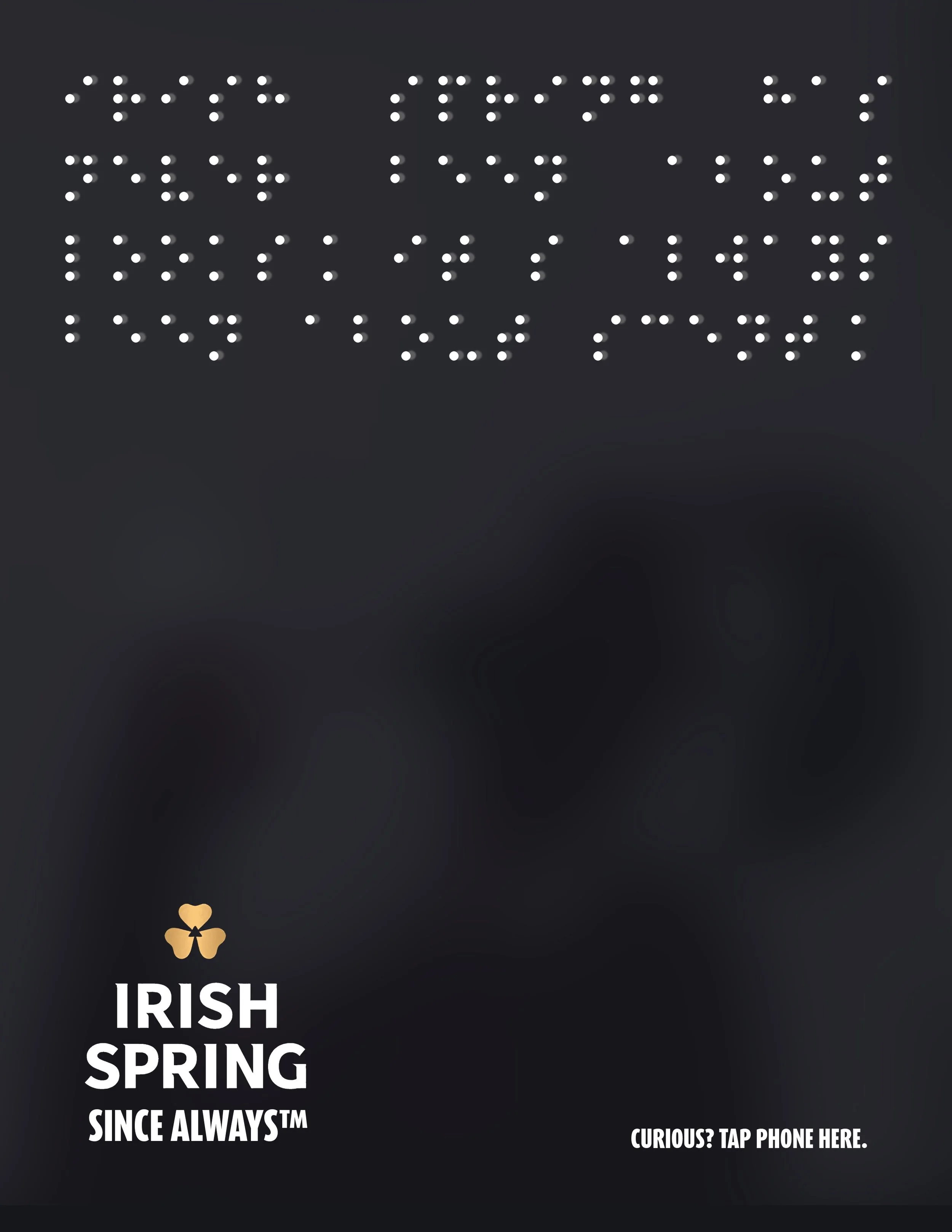
Braille: “Irish Spring has always been Irish Spring. Same scent since day one.”
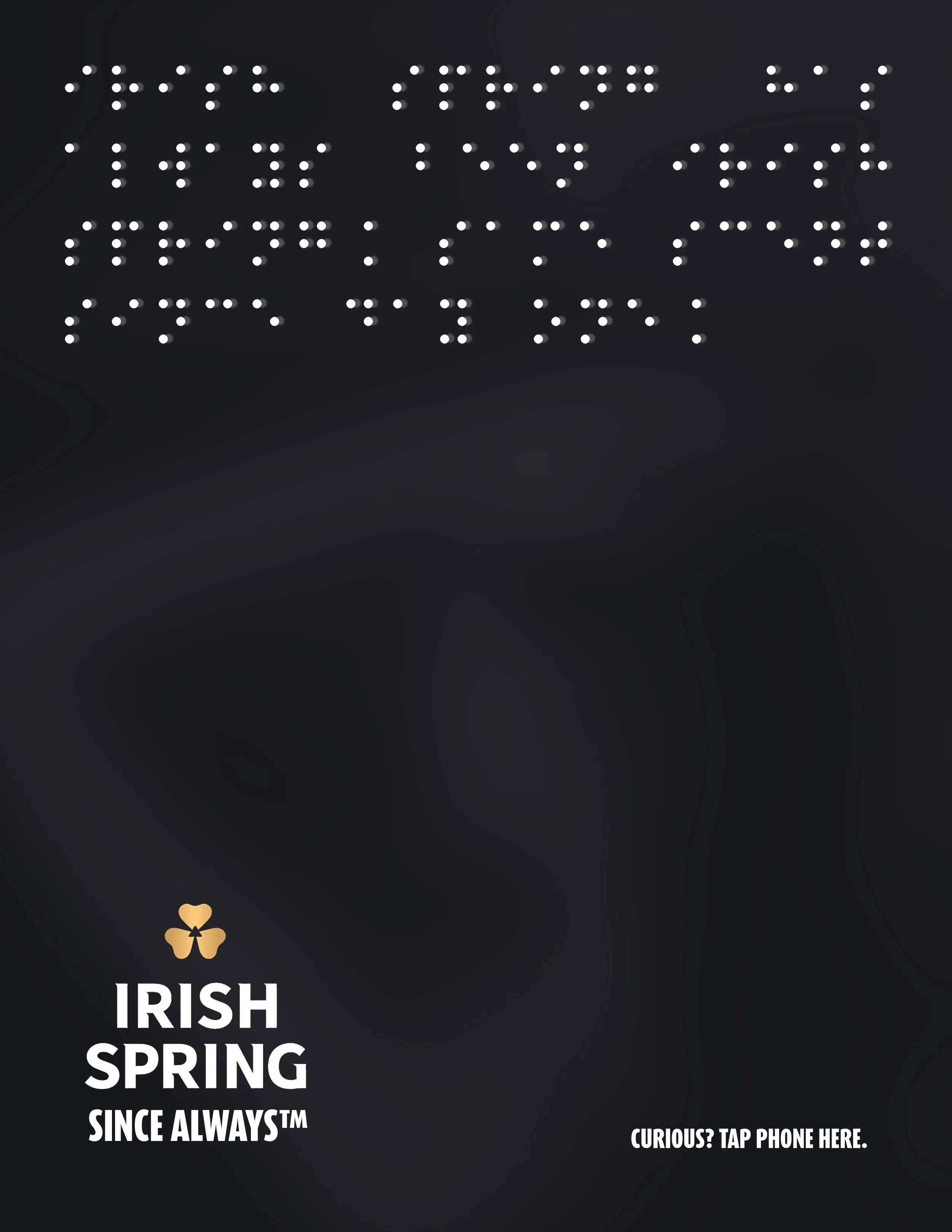
Braille: “Irish Spring has never been about looks. It’s always been about scent.”
Audio-Described Commercial
A visual-free spot that uses vivid audio description to recreate a classic Irish Spring ad, proving a commercial can be just as immersive without a single frame on screen and allowing sighted consumers to experience ads like the blind do.
Braille in Daily Touchpoints
Braille messages appeared on handrails, turnstiles, door handles, and crosswalk buttons—places where only blind audiences would notice and could “read” them, creating intimate, sensory-first interactions.

Braille: “Don’t forget to wash your hands. Irish Spring.”

Braille: “ Food is better with fresh hands. Irish Spring.”

Braille: “Lights change. Our soap doesn’t. Irish Spring.”
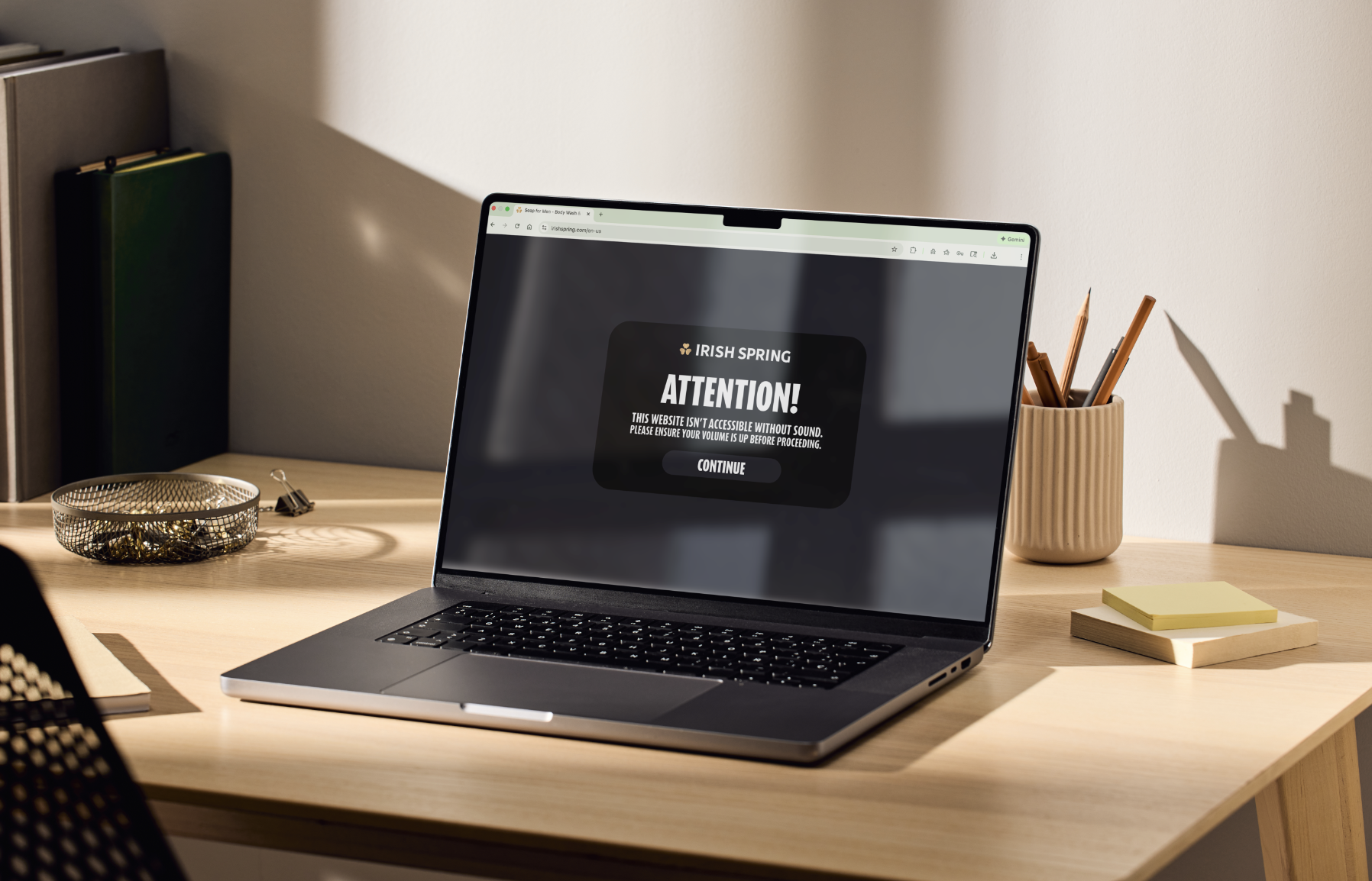
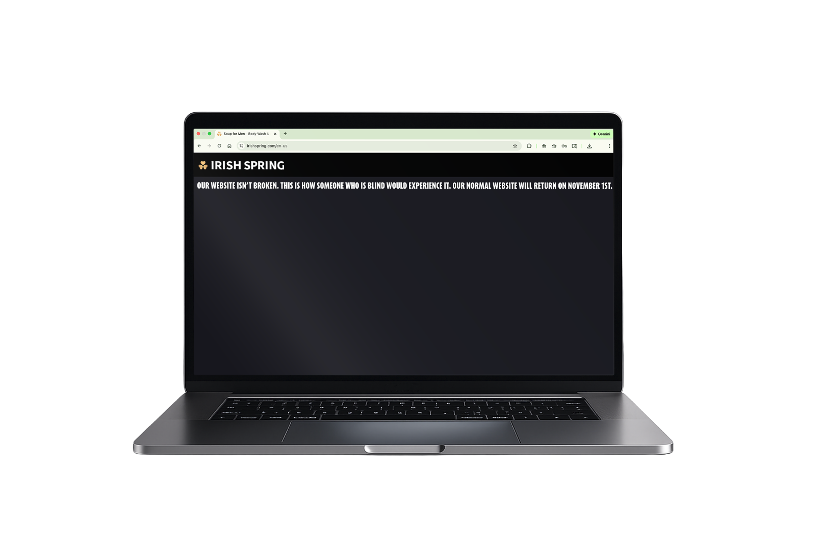
Website Blackout
The Irish Spring site went completely black for the month of October (Blind Awareness Month), inviting users to navigate the brand the same way blind consumers do: through screen readers, audio cues, and nonvisual design.
Packaging Redesign
Irish Spring’s packaging was reimagined with blacked-out visuals and Braille descriptions, making the product itself accessible and unmistakably centered on blind consumers.

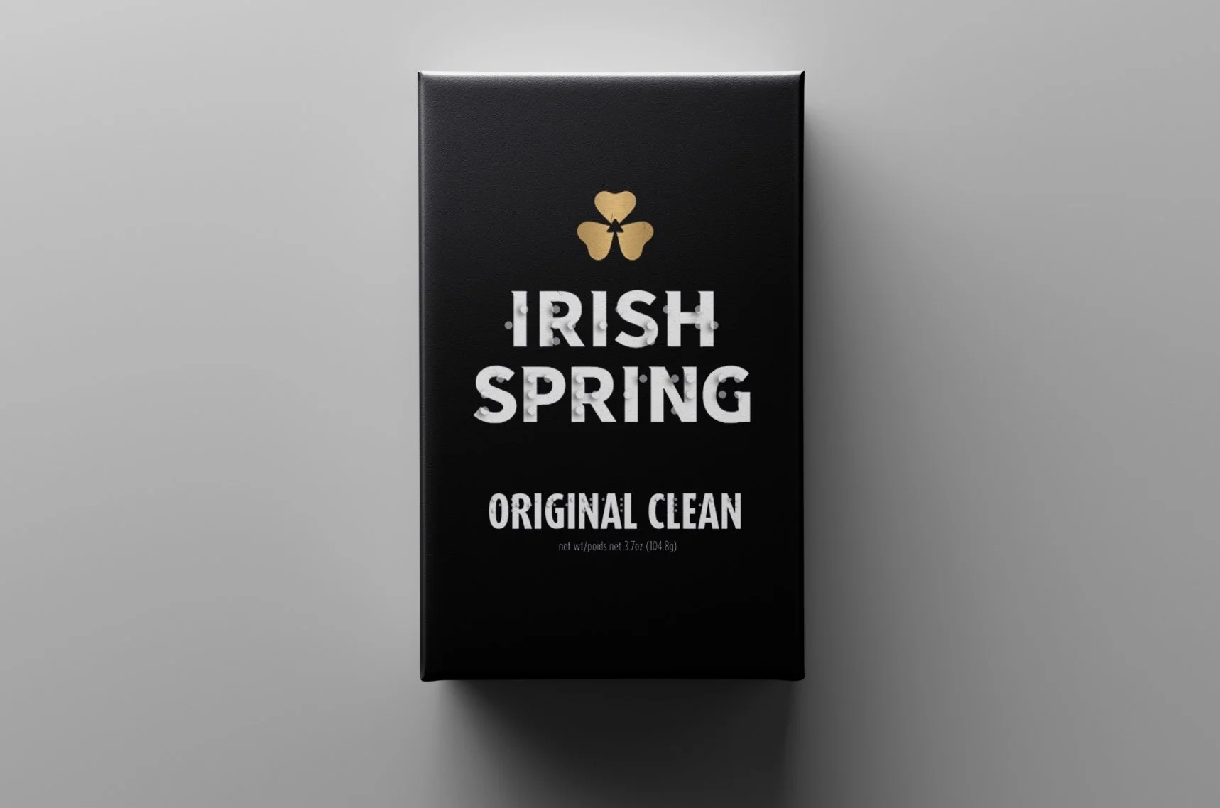
Instead of black or gray, the soap uses eigengrau, the soft, natural darkness often perceived by blind individuals rather than total, pitch-black voids.
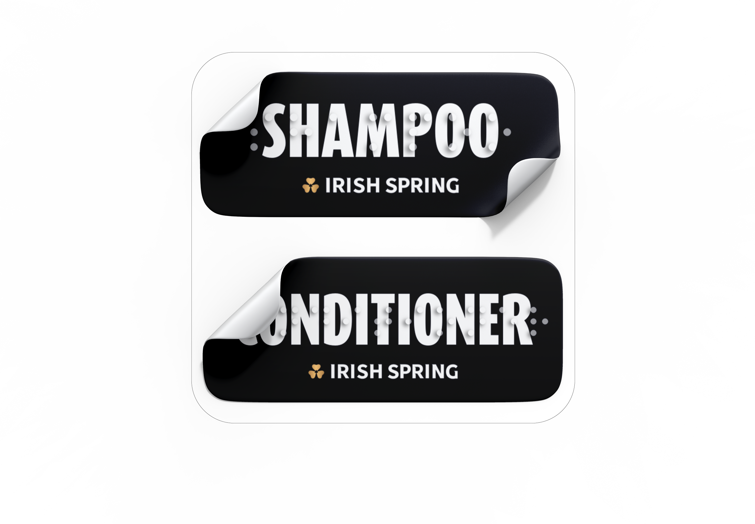
Braille Bathroom Accessibility Stickers
Every purchase came with Braille label stickers for common hygiene items, helping blind consumers transform their entire bathroom into a more accessible space.
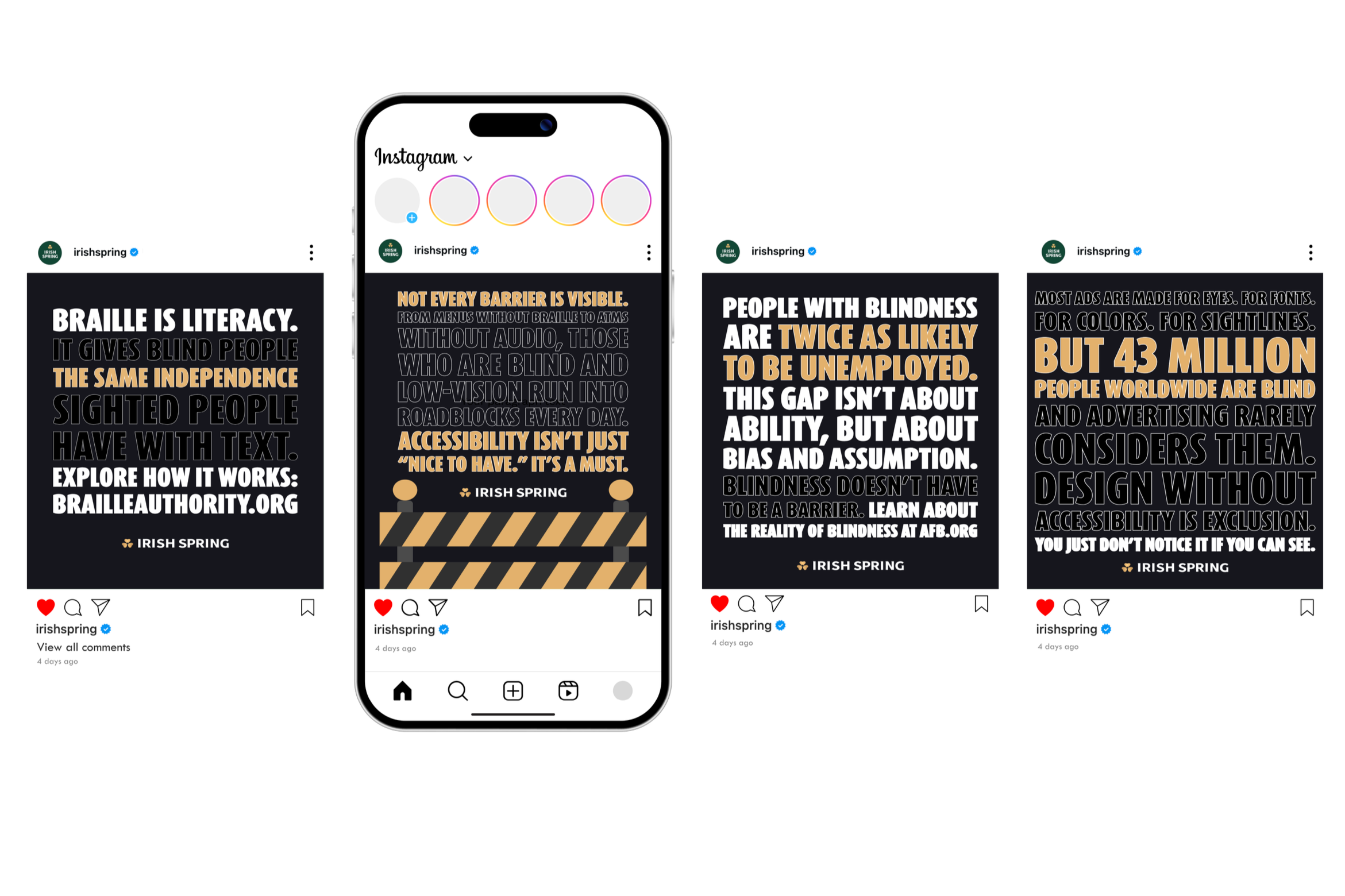
Social Media
On socials, Irish Spring widened the conversation with posts on blind awareness, Braille basics, and campaign context, bringing sighted viewers into an experience they normally overlook and aiming to create change in the industry.